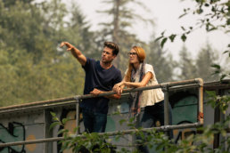
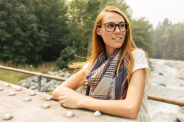
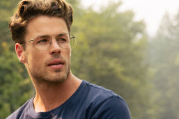
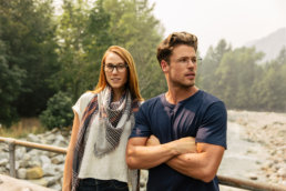
Photography
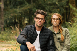
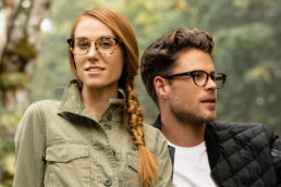
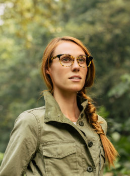
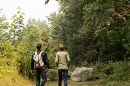
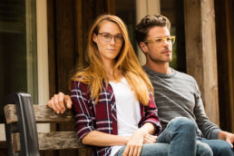
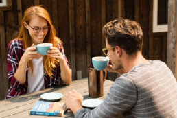
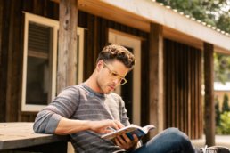
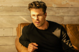
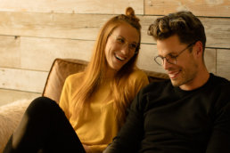
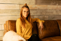
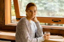
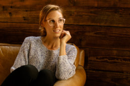
We shot with natural light only to emphasize the natural, outdoorsy feel. My guiding words during the shoot were light, dynamic, natural.
Treatment
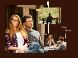
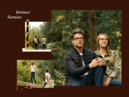
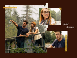
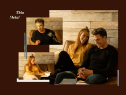
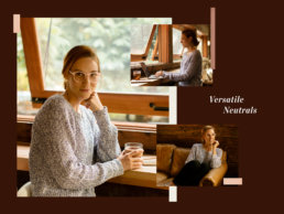
I decided to place the primary focus of the visuals on the photography and use the textures and materials of each trend as accents. Collage seemed the perfect solve for this mix of elements and hierarchy, so I created one for each trend. Each collage features a number of photos with embellishments highlighting that trend’s unique features and textures.
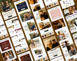
Eleven emails were sent over the course of the campaign; two per week plus a wrap up to cap things off. The first weekly send introduced the trend with a sales focus. The second, editorial style send, took a deep dive into the trend itself with a focus on style. The email component of the campaign concluded with a wrap up send, summarizing all 5 trends.
Website
The campaign page showcased the collages, additional photography and associated products on a merchandised page. The page structure was quite rigid, allowing only one hero image per section. This made the collages the perfect solve, enabling us to showcase multiple photos and accents from each trend in a single image.
