


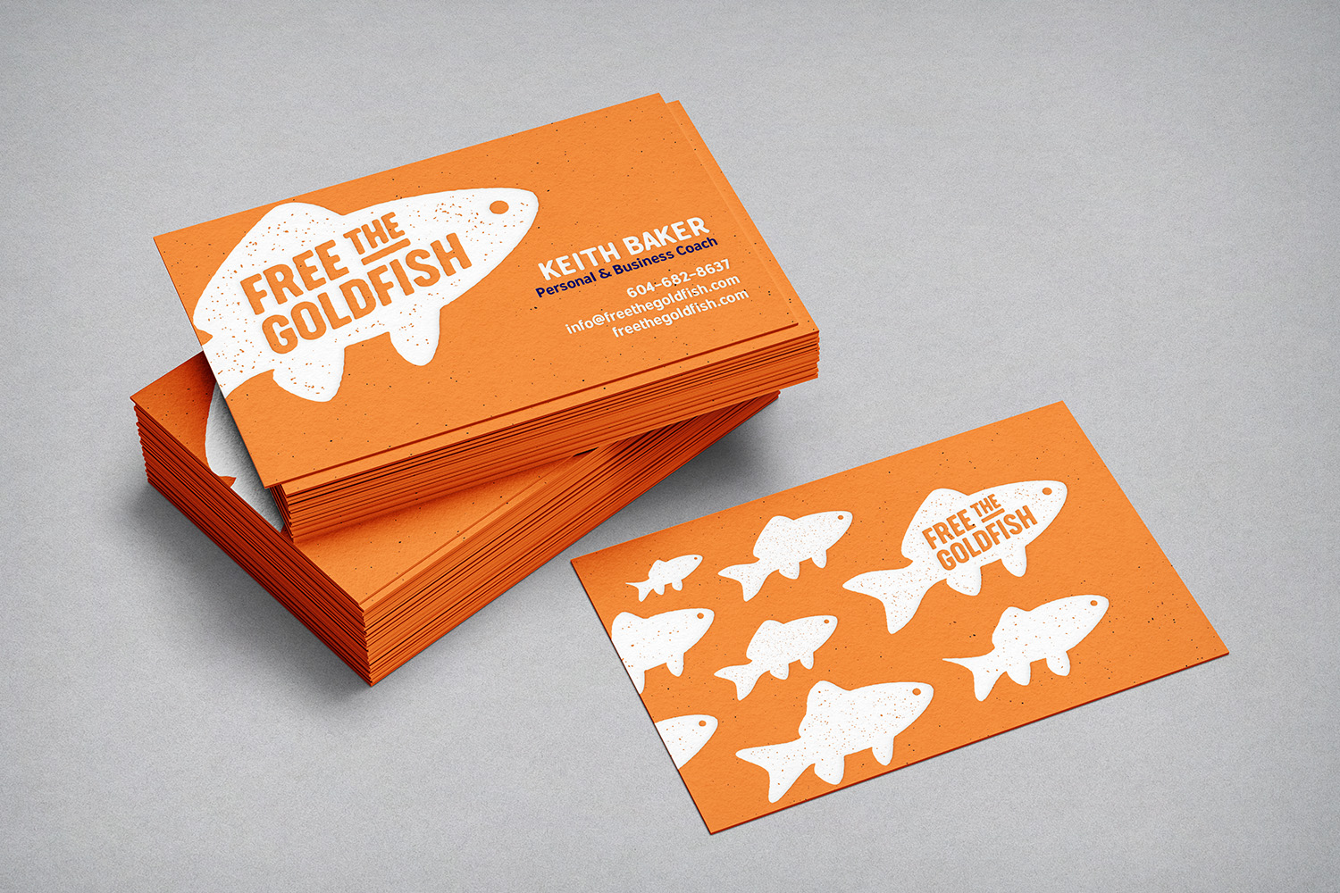


Keith, the founder and head honcho of Free the Goldfish, approached me to create the company’s logo. A goldfish’s growth is dictated by the size of its environment. Similarly, our professional growth can be restricted by our situations and the limitations we place on ourselves. Through professional coaching, Keith aims to help his clients break free of their limitations to help them realise their full potential.
Keith wanted the identity to stand out from the crowd and asked for something that caught the eye and piqued people’s interest. Through my explorations I realised that a distressed, rubber stamp style would be a major departure from the stuffy, vanilla styles of so many professional coaching businesses, and could be a great differentiator. Thankfully Keith agreed and the grungey fish was born.
Free the Goldfish Coaching Inc. • 2019
Art direction
Brand development
Graphic design