K.I.S.S.
Simplicity was key
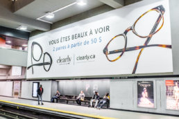
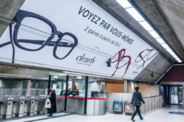
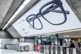
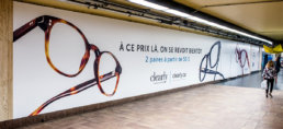
Surprisingly, back in 2018 Québecers were not much into shopping online. E-commerce had very low penetration in Québec, so we decided to make simplicity a priority and emphasize two things: the product and the offer.
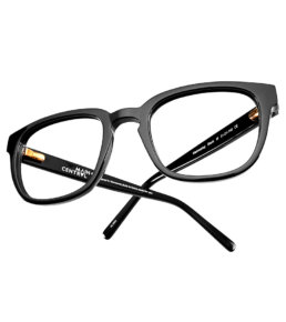
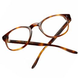
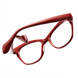
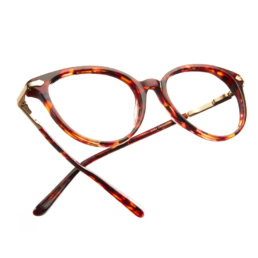
By featuring clean, minimal, yet engaging photography of our product, it would be impossible to misconstrue the product offering. Combing that with a short and to the point offer, the speediest of commuters had enough time to absorb the message, even if they were completely new to the brand.
Wall murals x2
20’ x 30’ – 6 x 9m
Vertical mega wall mural x1
28’ x 9’ – 8.5 x 5.7m
Backlit posters x17
5.5’ x 4’ – 1.6 x 1.2m
Mega murals x2
6.5’ x 26’ – 2 x 8m
Wall murals and columns x2
16’ x 22’ – 4.8 x 6.7m
Mega mural x1
9’ x 69’ – 2.7 x 21m
3
Québec stations
13
Design pieces
25
Placements
67,562
