

I was approached by Dr Spiro Pazios as he was looking to rebrand his two orthodontic practices. He simply said “I want a new logo that’s professional, cool, and that will last me for the rest of my career. And don’t put any teeth in it.”
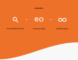
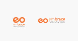
With that fantastic brief I aimed to create a modern and dynamic mark. This was the fashion in which the practice operated, so it made sense their visual identity should match.
Embrace Orthodontists • 2012
Art direction
Brand development
Graphic design